High-fidelity is about being as true to the original sound as much as possible. Unlike the click-and-go scenario, LPs provide a room-filling, immersive listening experience, and our client’s products had been specially created to elevate the entire act of enjoying analog music.
This hi-fi industry brand came to us with a history of success and a loyal customer base only set to grow. However, their overly plain design fell short in effectively communicating to analog lovers that these products can help them take care of their precious LP collection in the best way possible. The company offers an array of meticulously crafted cleaning tools, sound adjusting devices, and sturdy decorative holders whose online presence didn’t reflect their exceptional quality.
After doing a thorough competitor analysis, we gained an insight into their current positioning and located a weak point. Namely, their presence didn’t communicate to the public the main elements (exceptional craftsmanship, attention to details, passion, understanding of sound, and high-quality materials) poured into the making of their products.
As our team became more familiar with the company ethos, we saw the potential to tailor our strategy to do for these products what they do for analog sound: emphasize, clarify, and upgrade, thus establishing a solid connection to the analog lovers in meaningful ways.
The building blocks that helped this brand nest in the home of more LP enthusiasts included textual and visual content. Backed by experience and armed with multi-level marketing expertise, our Fliprise specialists dived into this challenge, inspired and motivated.
Photography

The client’s products were themselves a union of form and function – they looked appealing, professional and played vital roles in curating a quality listening experience. So, we poured our efforts into merging effective design that informs with eye-catching elements that can inspire analog lovers and win their hearts. We also managed to create professional photographs with such uniquely clean aesthetics that rendered the brand recognizable even without design elements. We also made sure to create appealing photographs that can be used for various purposes across multiple channels.
Vocabulary
Focusing on understanding the mindset, problems, and needs of audiophiles, we succeeded in providing true value through textual content. We ensured that potential users could understand turntable accessories more easily, identify them properly, and grasp how to use them correctly. We created content that teaches, explains, motivates, and clarifies instead of creating clutter and confusion.
Amazon Presence

For the listing, we relied on our 6 years of experience in successful block creation to improve the typography’s hierarchy structure and rendered it more appealing. We also added new and trendy design elements to stand out from the competition, yet succeeded in maintaining a retro and nostalgic feel to appeal to people longing for the golden age of the music.
Regarding the A+ content, we focused on creating dynamic and consistent design that expands on the products’ benefits. We did that by adding quality and attractive banner images, informative graphics and textual content that accompanies the images well and completes the message positioning the company as favorable, valuable, and credible to audiophiles.
For the storefront design, we worked on a practical and attractive design that stands out from the world of noise with clarity and intuitive organization. Eventually, it all came together, forming a rich visual vocabulary unique to the brand.
Through the product videos we created we helped this company gain a competitive advantage in the crowded marketplace. Due to the specific uses of the products, the Fliprise team focused on communicating a large amount of information in a compact and fast manner while striking an emotional chord.
Our team had so much fun putting the cleaning devices, adjusting instruments, and decorative holders to use, and we took our time to really understand the care and dedication of analog lovers. Then we translated that into an art form of its own through upbeat and superb videos presentations.
Packaging Design

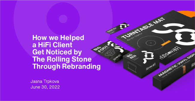
Drawing inspiration from the iconic look of vinyl records themselves, we created sleek packaging designs that incorporated subtle visual reminders of LPs. Our goal was to utilize the packaging as a strategy to connect to the customers – we wanted to both catch their attention and clearly provide basic information about the product. While developing the aesthetics, we constantly consulted the customer base through reviews and polls to ensure we were on the right path to providing the client with the highest quality of work.
Summary
Today, this brand helps the analog world spin better in style, with an elegant personality, reorganizable across various channels. They are now one of the leading high-fidelity brands on Amazon, with a strong visual presence on the first page that matches the quality of their products. After its transformation, the company was even featured in the Rolling Stone magazine!
The content created for Amazon is fully mobile compatible and can be integrated on various social media platforms and used for future promotional and marketing strategies. Our flexible Fliprise designs allowed this brand to avoid being repetitive across a multitude of channels and applications while maintaining the qualities that define it.


